Looking back at your preliminary task, what do you feel you have learnt in the progression from it to the full product?
Looking back at the preliminary task, I feel that I have vastly improved my knowledge of creating a magazine and I now know a great amount more about the programs, software and technology that are involved in this process.
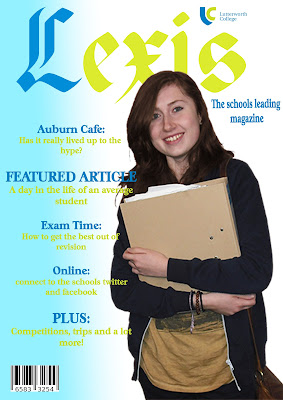
Firstly, the text on my music magazine is placed so it flows with the image, whereas on my school magazine the text placement has clearly not been planned out; it has been centered within the text box and placed at the left hand side of the magazine, with no consideration for where the image is to go. Although I think the font on the school magazine fits in with the 'Old English' feel of the title, I think the fonts on ROGUE associate a lot better with the genre and layout of the magazine. The amount of text on ROGUE is also a lot more suited to the genre and tells the audience what will be inside the magazine, whereas Lexis has a minimal amount of text, so leaves the cover looking too plain with far too much space.
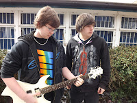
The images on each of the magazines are very different. On Lexis, I have the photo of a student whereas on ROGUE I have a photo of a rock musician. For Lexis, I did not consider things such as lighting, costume, hair or make up - which left my model appearing as though they were in a photograph rather than appearing on the cover of a magazine. If I were to do the image again, I would dress my model in the school uniform and use better lighting in order to reinforce that it is a school magazine.
For ROGUE, I had a lot more knowledge on magazine photography so I was able to produce an image that was suited to my genre, with thought on what the model would wear and what make up she would have on. Therefore, I had a lot more control over what my cover image would look like.
In terms of the colour scheme, I tried to make Lexis with the school colours - however I feel that this makes the colours clash (especially the green) with the background. I also used the gradient tool on photoshop to create the blue at the left hand side, but I feel now that this doesn't look professional: It makes it difficult to read the text and forces too much attention towards the barcode, making it stand out more than the rest of the magazine. ROGUE has a colour scheme of black, white and red, therefore it was a lot easier to read the black text on the white background, and the red makes the magazine appear more vibrant and interesting. Thus the magazine seems a lot more professional that Lexis,


